Making business finance feel simpler from the first click
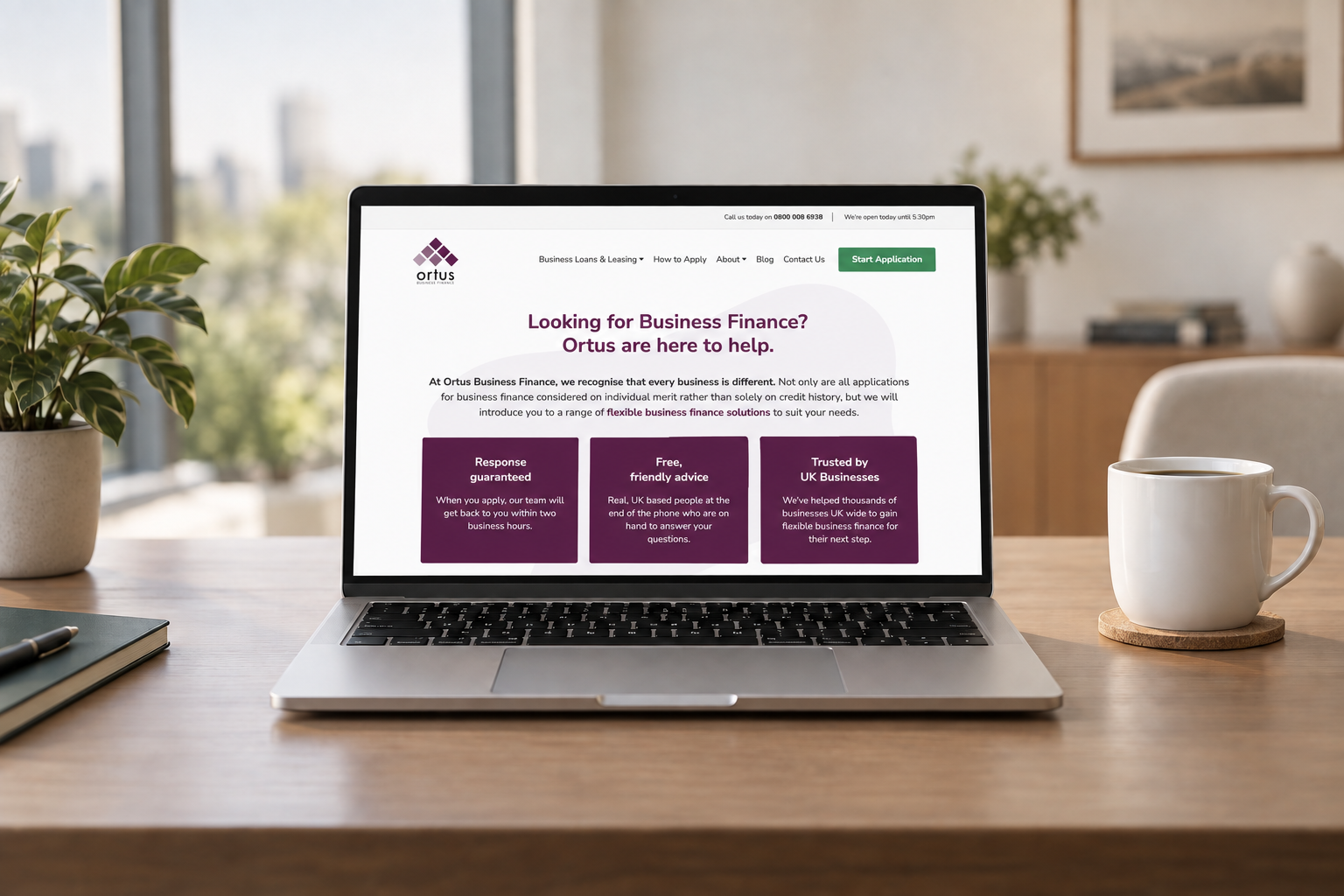
- 1 new identity Bringing a more human feel to business finance
- 3 Steps Replacing one long finance application journey
- 2020 The year we began working with Ortus
Ortus Business Finance helps businesses access funding through a wide network of finance providers, finding suitable options around the individual needs of each customer.
When Ortus approached us in 2020, its existing website no longer reflected the business. The design felt dated, the WordPress installation needed modernising, and applying for finance involved a journey that could feel more complicated than it needed to be.
We redesigned the experience around the qualities Ortus wanted customers to recognise straight away: friendly, knowledgeable and straightforward support.
- A complete redesign around a more approachable finance brand
- A clearer user journey from researching finance to making an application
- Custom illustration used to create a distinctive identity in a traditionally corporate market
The challenge
Business finance can feel complicated before a customer even starts an application.
Ortus needed its website to make that process feel easier, while still communicating the information customers needed to make an informed decision.
Its existing website ran on an outdated version of WordPress and no longer reflected the business’s personality. Like many companies in the finance sector, it also struggled to stand out in a market dominated by similar layouts and generic corporate photography.
The application itself required a significant amount of information, so we also needed to make a naturally long process feel manageable rather than overwhelming.
What we did
- Website design and development
- UX and wireframing
- WordPress development
- Application journey design
- Multi-step form development
- Conversion-focused calls to action
- Content structure and navigation
- Custom illustration direction
- Responsive design
- SEO-friendly website structure
The result
We created a cleaner, more accessible website that made Ortus’s services easier to understand and navigate.
During the design process, we worked with illustrator Steve Roberts to develop a collection of distinctive characters for the brand. These gave the website a warmer visual identity and helped Ortus move away from the conventional imagery commonly used across the finance sector.
We also reworked the application journey, splitting the form into three clear stages: applicant details, business details and financial details.
A visible progress indicator helped customers understand where they were within the application, turning one long form into a more manageable step-by-step process.
The finished website gave Ortus a fresher, easier-to-manage online presence and helped generate more qualified enquiries through the site.
“Very helpful!”